
Flight Booking
Redesigned checkout flow and booking experience for luxury airline, increasing conversions by 15% and reducing abandonment by 24%.
Aero is a semi-private airline, a more luxurious alternative to flying commercial. I led the redesign of its booking experience, from how people discovered flights to how they paid for a seat.
People came to dream, not to book
Most of Aero’s traffic came in through its blog: destination guides and travel inspiration, people reading about a weekend in Aspen. The analytics told a clear story. They were coming to dream, not to book. And the moment they finished an article, the site dropped them onto a checkout page that had nothing to do with what they’d just been reading. The handoff was jarring, and a lot of people left right there.
A few things were working against us at once. Checkout abandonment was high. The reading experience and the buying experience felt like two products bolted together. The flow had been built for desktop even though more than 70% of our traffic was on mobile. And once you did reach checkout, it felt like paying a utility bill instead of booking a getaway.
The middle step nobody designed for
I spent time in user interviews and session recordings, and the same pattern kept coming up. People moved through three states before they booked. First they were just dreaming about a destination. Then they started weighing it seriously, looking at dates and prices. Only after that were they ready to commit.
Our flow skipped the entire middle. It took someone straight from dreaming to a checkout form, with nothing in between to help them actually decide. Closing that gap became the thing the whole redesign was built around.
Closing the gap between reading and booking
Instead of treating the blog and the checkout as two separate places, I designed one continuous path that met people wherever they were in that journey.
Flight options inside the content
The first move was to bring booking into the articles themselves. As you read about a destination, flight options for that destination showed up inline, with real dates, live pricing, and departure times. You could see what a trip to the place you were reading about actually cost without leaving the page or breaking the spell of the article.
Two rules kept these from feeling like ads. The flight details had to look like they belonged in the article, and the price you saw up front had to be the price you paid.
A blog that could sell
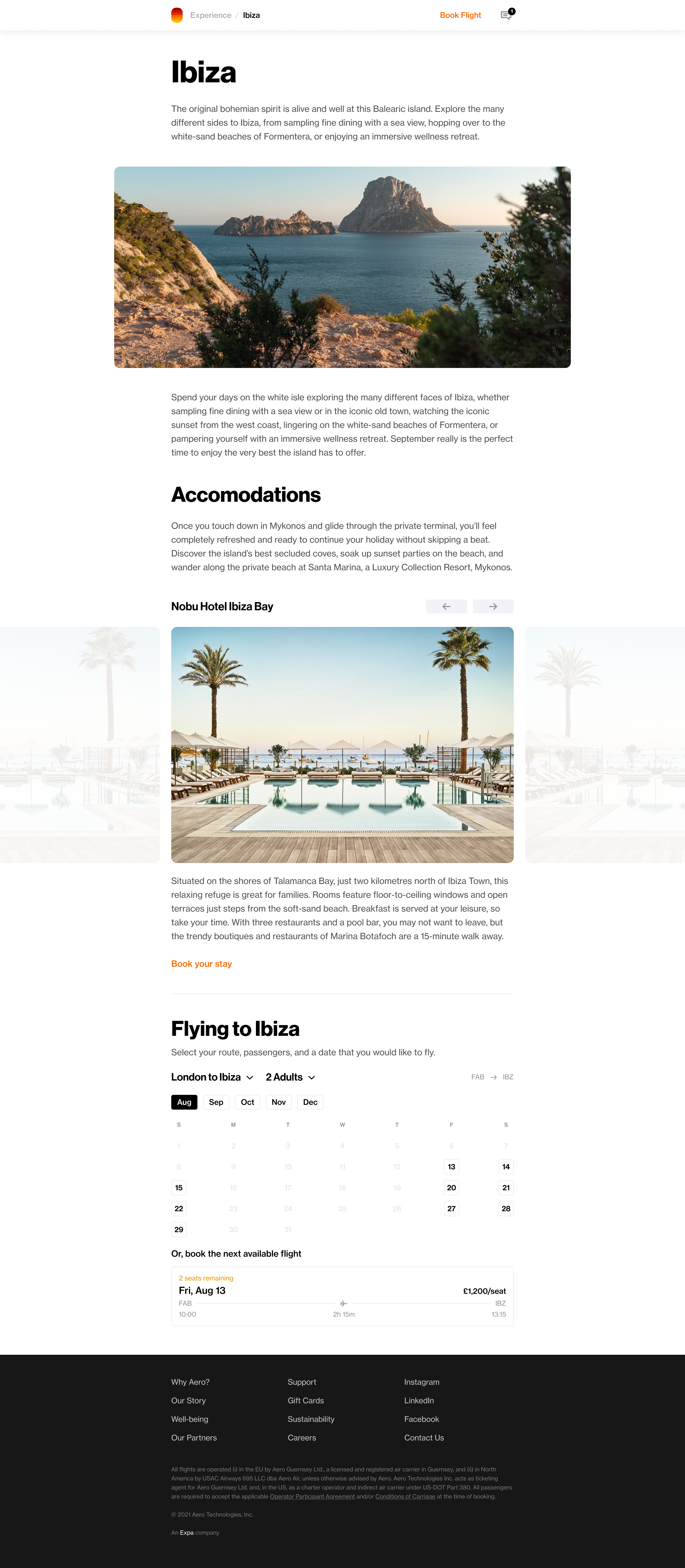
I rebuilt the blog layout so it could carry commerce without turning into a catalog. Flight cards sat in the natural breaks of the page as you scrolled, and booking details opened up only when you wanted them, so the page kept the clean, open feel Aero is known for.
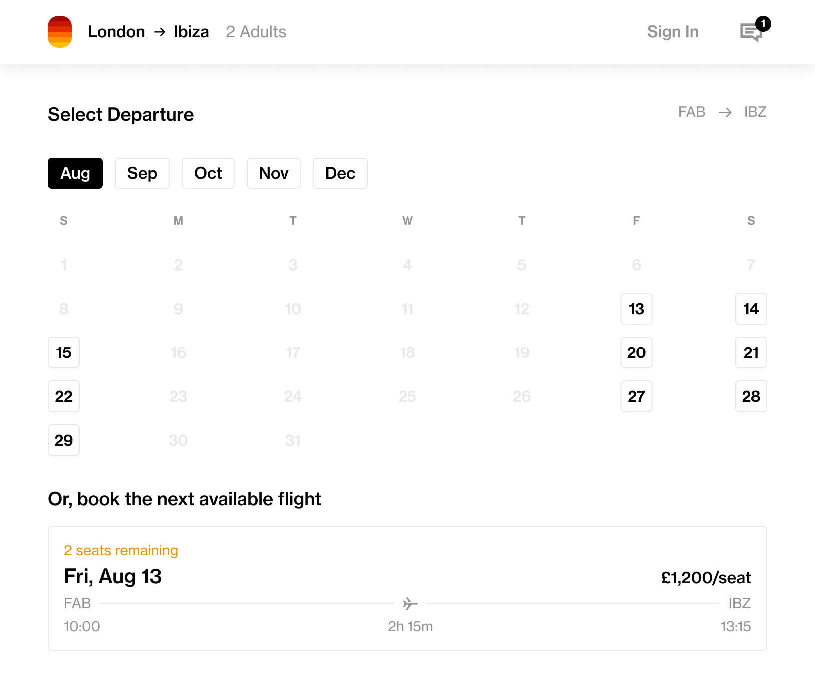
Checkout built for a phone
With most people booking on their phones, I rebuilt checkout for mobile first. I cut the number of form fields by about 40% using smart defaults, added one-tap payment with Apple Pay and Google Pay, and leaned on autofill and inline validation so people made fewer mistakes. Pages loaded faster, and the whole flow kept Aero’s clean, spacious look. The goal was to make paying the easy part.
Beyond the booking flow
Gift cards
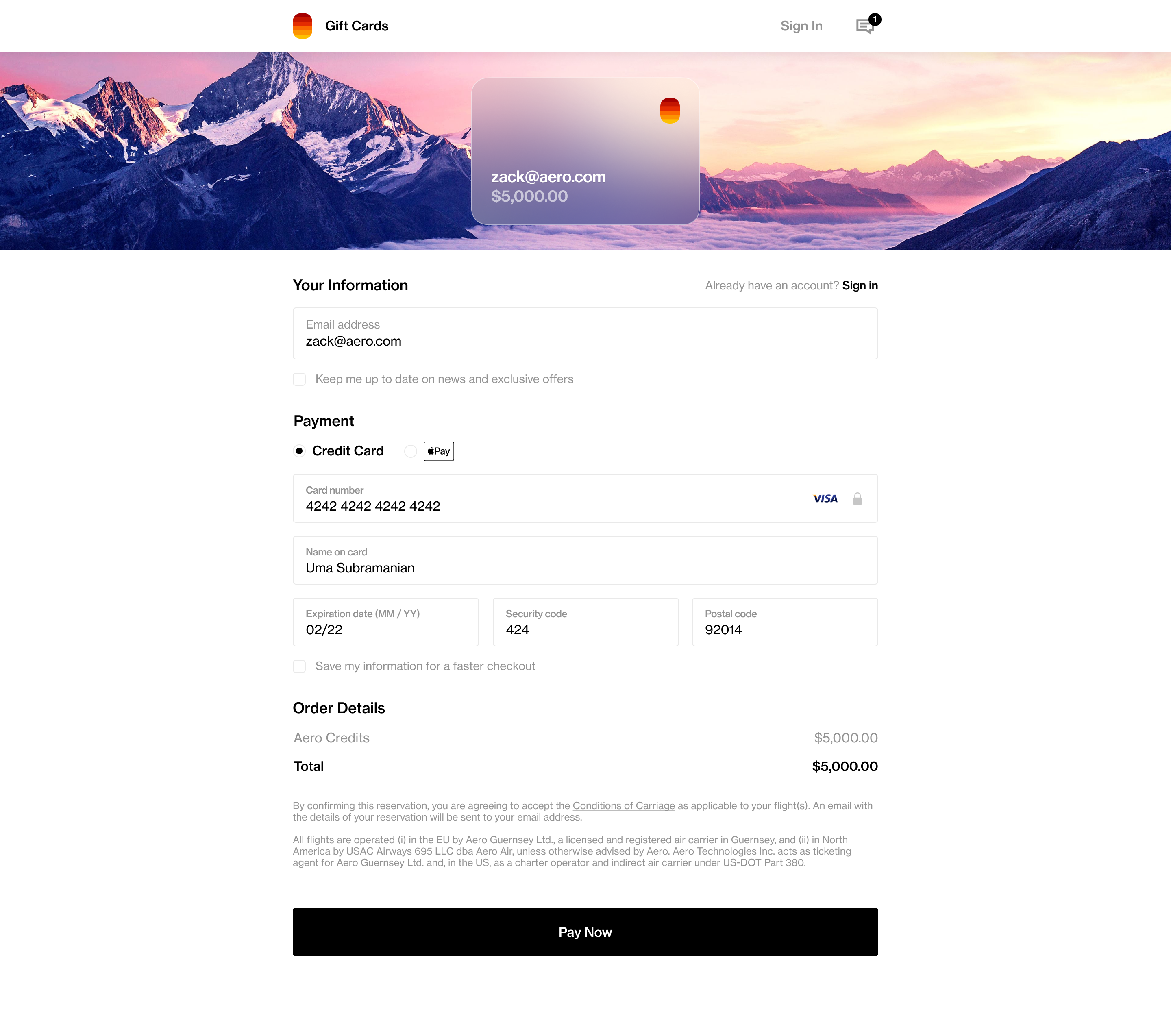
I designed Aero’s first digital gift card, which opened a new revenue stream and, as it turned out, did most of its business around the holidays. The flow made it easy to buy a card, personalize it, and send it. I wanted it to feel like you were giving someone an experience rather than a dollar amount, with small touches of animation and personalization that matched the rest of the brand.
Terminal app
I also designed an iPad app for Aero’s ground staff. It handled passenger check-in, flight manifests, and real-time updates, replacing a lot of manual steps so the team could put their attention on passengers instead of paperwork. For people working a busy terminal, it had to be fast and unambiguous, so I kept it clean and built it for speed.
What changed
After the redesign we saw real movement where it mattered:
- 15% increase in conversion rate
- 24% reduction in checkout abandonment
- 35% faster mobile checkout completion
- A new revenue stream in gift cards, which took off around the holidays
The part I’m most proud of is harder to measure: booking a flight stopped feeling like a separate, transactional chore and became a natural continuation of the browsing and planning people were already doing.
Looking back
The lesson that stuck with me was to design for where someone is in their head, not just the screen they’re on. The win here wasn’t really a better checkout form. It was reconnecting the path from inspiration to booking that the old flow had split in two.